The Psychology of Colours in Event Branding
In the world of event marketing, first impressions are formed in seconds. Before a visitor reads a message, speaks to a representative, or interacts with a product, they respond to visual cues—especially colour. Colour is one of the most powerful tools in branding because it influences perception, emotion, and behaviour almost instantly.
For companies participating in trade shows, festivals, and promotional events, understanding the psychology of colours in marketing is essential. The right colour choices can attract attention, communicate brand values, and create memorable experiences that last long after the event ends.
At Airloft, where branded gazebos, inflatable structures and custom event installations are designed for maximum impact, colour plays a central role in helping brands stand out and connect with their audience.
In this article, we explore how colour psychology influences event branding and how businesses can use it strategically to enhance visibility, engagement and brand recall.
Why Colour Matters in Event Branding
Colour is often the first element people notice in a visual environment. In busy event spaces filled with competing brands, colour becomes a key differentiator.
Studies in marketing psychology show that people form subconscious judgments about a brand within seconds, and colour plays a major role in this process.
At events, where attention spans are short and competition is high, colour helps brands:
- Capture attention quickly
- Communicate identity instantly
- Evoke emotional responses
- Improve brand recognition
Airloft integrates colour strategy into every custom structure, ensuring that gazebos, arches and installations not only look attractive but also serve a strategic branding purpose.
The Emotional Impact of Colours
Each colour carries psychological associations that influence how people feel and behave. Understanding these associations allows brands to design event spaces that align with their messaging.
Red: Energy and Urgency
Red is a powerful and attention-grabbing colour. It is associated with excitement, passion and urgency. Brands often use red to stimulate action and create a sense of dynamism.
At events, red structures or accents can attract visitors from a distance. Airloft often incorporates bold red elements into designs for brands that want to create a strong, energetic presence.
Blue: Trust and Professionalism
Blue is commonly associated with trust, stability and reliability. It is widely used by corporate and technology brands.
A blue-themed gazebo or event structure can create a calm and professional atmosphere, encouraging visitors to feel confident in the brand.
Airloft frequently designs blue-based branding solutions for companies aiming to communicate credibility and expertise.
Green: Sustainability and Balance
Green represents nature, health and sustainability. It is particularly effective for eco-conscious brands.
Incorporating green into event structures—through fabrics, graphics or natural elements—can reinforce environmental messaging.
Airloft supports sustainable branding by combining green colour schemes with eco-friendly materials.
Yellow: Optimism and Visibility
Yellow is associated with happiness, optimism and creativity. It is highly visible and effective for attracting attention.
Used strategically, yellow can make a booth feel welcoming and energetic. However, it should be balanced with other colours to avoid overwhelming visitors.
Black: Luxury and Sophistication
Black conveys elegance, power and exclusivity. It is often used by premium brands to create a refined image.
Black structures or accents, combined with high-quality materials, can elevate the perceived value of a brand’s presence at an event.
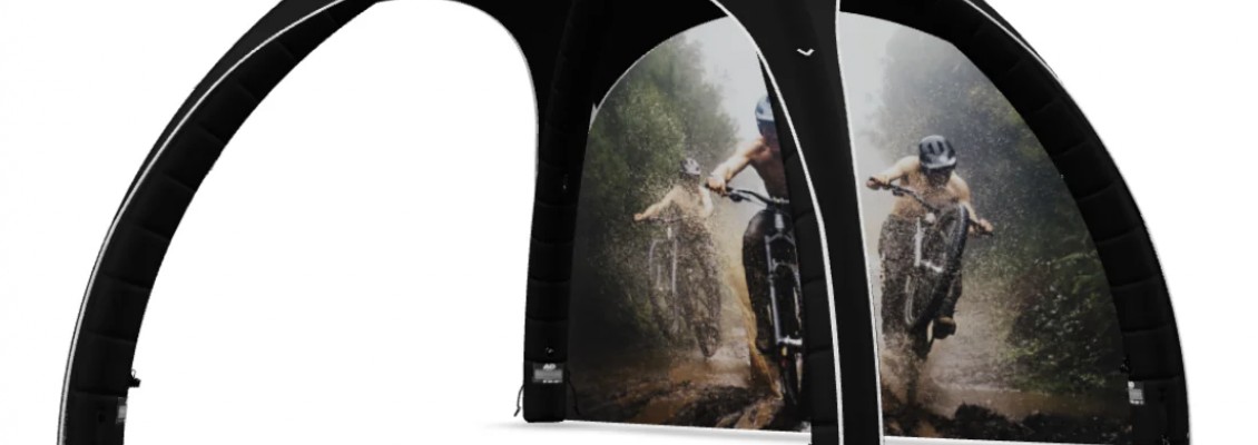
Airloft designs premium gazebos and installations that use black to create a sophisticated and modern look.
White: Simplicity and Clarity
White symbolises purity, simplicity and minimalism. It is often used to create clean and modern designs.
In event branding, white can help highlight other colours and create a sense of space and clarity.
Colour Combinations and Brand Identity
While individual colours are important, their combinations are even more powerful.
Successful event branding relies on a consistent colour palette that reflects the brand’s identity.
Key considerations include:
- Contrast: Ensures visibility and readability
- Harmony: Creates a cohesive look
- Consistency: Reinforces brand recognition
Airloft works closely with brands to ensure that colour combinations are applied consistently across all event elements, including gazebos, banners, flags and furniture.
This consistency helps create a unified and professional appearance.
Using Colour to Guide Visitor Behaviour
Colour can also influence how visitors move and interact within a space.
For example:
- Bright colours can highlight key areas such as entrances or product displays
- Neutral tones can create calm zones for conversations
- Contrasting colours can define pathways or sections
By using colour strategically, brands can guide visitors through their booth and enhance the overall experience.
Airloft structures can be customised to incorporate these principles, helping brands design functional and engaging spaces.
The Role of Colour in Brand Recall
Colour plays a crucial role in memory. Consistent use of colour across marketing materials increases brand recognition significantly.
When visitors repeatedly see the same colours on gazebos, banners and digital content, those colours become associated with the brand.
Airloft ensures that event structures align perfectly with a brand’s visual identity, reinforcing recognition both during and after the event.
Adapting Colours to Different Events
Different types of events may require different colour strategies.
For example:
- Festivals may benefit from bright, vibrant colours
- Corporate exhibitions may require more neutral or professional tones
- Outdoor events may need high-contrast colours for visibility
Airloft designs adaptable structures that allow brands to adjust their colour presentation depending on the event context.
Lighting and Colour Interaction
Lighting can significantly affect how colours are perceived.
At indoor events or evening activations, artificial lighting can enhance or alter colours.
LED lighting integrated into Airloft structures allows brands to:
- Highlight key colours
- Create dynamic effects
- Adjust ambience in real time
This adds another layer of visual impact to event branding.
Cultural Considerations in Colour Psychology
It is important to consider cultural differences when using colours in international events.
Colours may have different meanings in different regions. For example:
- White may symbolise purity in some cultures and mourning in others
- Red may represent luck or danger depending on the context
Brands operating globally should adapt their colour strategies accordingly.
Airloft supports international brands by creating customised solutions that respect cultural nuances.
Conclusion
Colour is far more than a decorative element—it is a strategic tool that influences perception, emotion and behaviour.
In event branding, where first impressions are critical, the right colour choices can make the difference between being noticed or ignored.
By understanding the psychology of colours in marketing and applying it strategically, brands can create event spaces that attract attention, engage visitors and strengthen brand recall.
With expertly designed structures from Airloft, companies can bring their colour strategy to life through high-impact gazebos, inflatable installations and custom event environments.
In a competitive event landscape, colour is not just a detail—it is a powerful driver of success.
4 Comment(s)
이동 없이 집에서 편안하게 받을 수 있어 정말 좋았습니다. 관리 후 몸이 훨씬 가벼워지고 상쾌해졌습니다. 수원출장마사지 이용 경험은 기대 이상으로 만족스러운 시간이었습니다.
장시간 서서 일한 뒤 이용했는데 몸이 훨씬 가벼워졌습니다. 관리가 세심하게 이루어져 피로를 효과적으로 완화하는 데 도움이 됐습니다.
실질적인 내용이 많아 신뢰감 있게 읽었습니다. 유흥알바 관련 정보가 풍부하게 포함되어 있어 참고하는 데 큰 도움이 되었습니다.
서비스 이용이 쉽고 빠르게 진행되어 만족했습니다. 덕분에 상품권을 보다 실용적으로 활용할 수 있어 좋았습니다.
Leave a Comment